2015 – When it comes to my photo settings and Lightroom adjustments, this post is more or less redundant. Old Lightroom settings and generally old information. A lot can change in three years? I’ll leave the post as it is though, as the 72 dpi myth lives on, so you may want to read about that.
See the photo above? Have a good look at it and I’ll return to it later on in this post. In the meantime I thought I’d do a shorter entry for a change. Those whopping big trip reports are so time consuming. Do you realise my last post took a week to write? A few hours every night after work and then at least a day of tinkering before publishing. Man, it’s ridiculous, but then I’ll turn around and do it again, so it’s a wonder I get any actual walking done.
Now, images. I’ve discussed images and words in a post before. My conclusion is online writing can be a bit hard to take in, so I always try and break up a few paragraphs with a picture. You know what? This post is no different. I’ve tinkered a bit on this blog with photo sizes and I’ve finally reached what I think is an ideal method (for me that is).
I’ve read a lot of articles online about what’s the ideal size of file to upload for online viewing. Unfortunately, there’s a million ideas and no real definitive answer amongst the ton of stuff I’ve waded through (surprised?). I’ll mention some of what seems to make sense, but instead of me explaining it, as I don’t really have the technical expertise, I’ll give you some links which I’ve found to be really informative. Oh yeah, most of this only applies to Lightroom users. Sorry about that!
So, I’ve taken a punt and here’s what I’ve decided to do for all of my images in the past few months. I process my pictures through Adobe Lightroom 3, which as a program I find intuitive to use. I’ve never understood Photoshop, so Lightroom is a good alternative for my brain.
Here’s a screenshot of Lightroom settings I’m using. I always shoot in RAW because I was told a few years back to think of it film terms. The RAW image is your negative and the JPEG you produce from it is your photo. I mean, you always want to have the negative, don’t you? The massive file size sucks, but that’s the way it goes. Anyway…

Adobe Lightroom export settings
I process the RAW files and create a JPEG for uploading to the blog, I set the image sizing width and height in pixels to 1280 x 1024. This is a big picture and more than enough for blogging. The top right has a setting called ‘quality’ and I leave it 70 which keeps the file size down. If I increase it to 100 then the size gets large without any difference to the image quality that I can see.
I found a great guide for Lightroom users regarding what the ‘quality’ means in this case. I won’t rehash what he says, but you can find it at Jeffrey Friedl’s blog. I think that 70 is sufficient after playing around with different settings (taking into account Friedl’s suggestions) and the file size of the Du Cane Hut picture at the top is 260 KB, which seems reasonable.
Now, one thing that’s all over the internet is talk about dpi (dots per inch) and ppi (pixels per inch). In fact you’ll come across a lot of stuff that says to set your pictures to 72 dpi for uploading to the internet as it keeps the file size down. Well, I’m afraid to say, but that’s completely wrong.
Dpi solely relates to printing a photo. We’re not doing that are we? Instead of rehashing stuff I’ve read, this bloke has a simple explanation between the two and a quote from that link regarding ppi is,
..”number of pixels per inch in your image. This will affect the print size of your photo…”
Again, this is only to do with printing a photo and makes no difference to a pictures file size for use on the internet.
How do I know? Well, I tried it. I kept the width and height of a picture identical and processed one at 1 ppi and the other at 100 ppi. Guess what? The image file sizes are identical between the two. Ppi and dpi only relates to the printing of a photo, Again this bloke Andrew Dacey has an article called, ‘dispelling the dpi myth’ which explains things way easier than I could ever do.
It doesn’t convince people though, as there’s a comment in that link that says, “…saving at 72 ppi saves server space and bandwidth…” Well, I’m sorry to say, but it’s a complete myth, as the file size is identical. I can’t say more than that, other than to try it out and see what I mean. Why is mine on 70 in the Lightroom screenshot? No idea, but I think the default is 72, but remember it makes no difference to a photo for use online.
So, that’s my settings and I don’t declare it’s a definitive method. It seems to be working okay though and I’ve got a bit of uniformity with my images for the time being.
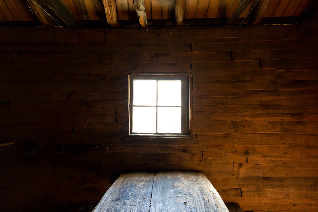
Now, back to what’s on an image itself. I worked with a person who’s a professional photographer and I’d bug her for information about images and how a photo should ‘look’. My view of a photo was always that it recorded a moment in time. Post production can enhance contrast etc, but not what’s in the actual photo overall. Remember the photo above? Well, this what it really looks like inside that hut.
[fusion_separator style_type=”none” top_margin=”4″ bottom_margin=”4″ sep_color=”” border_size=”” icon=”” icon_circle=”” icon_circle_color=”” width=”” alignment=”center” class=”” id=””/]
[fusion_separator style_type=”none” top_margin=”4″ bottom_margin=”4″ sep_color=”” border_size=”” icon=”” icon_circle=”” icon_circle_color=”” width=”” alignment=”center” class=”” id=””/]
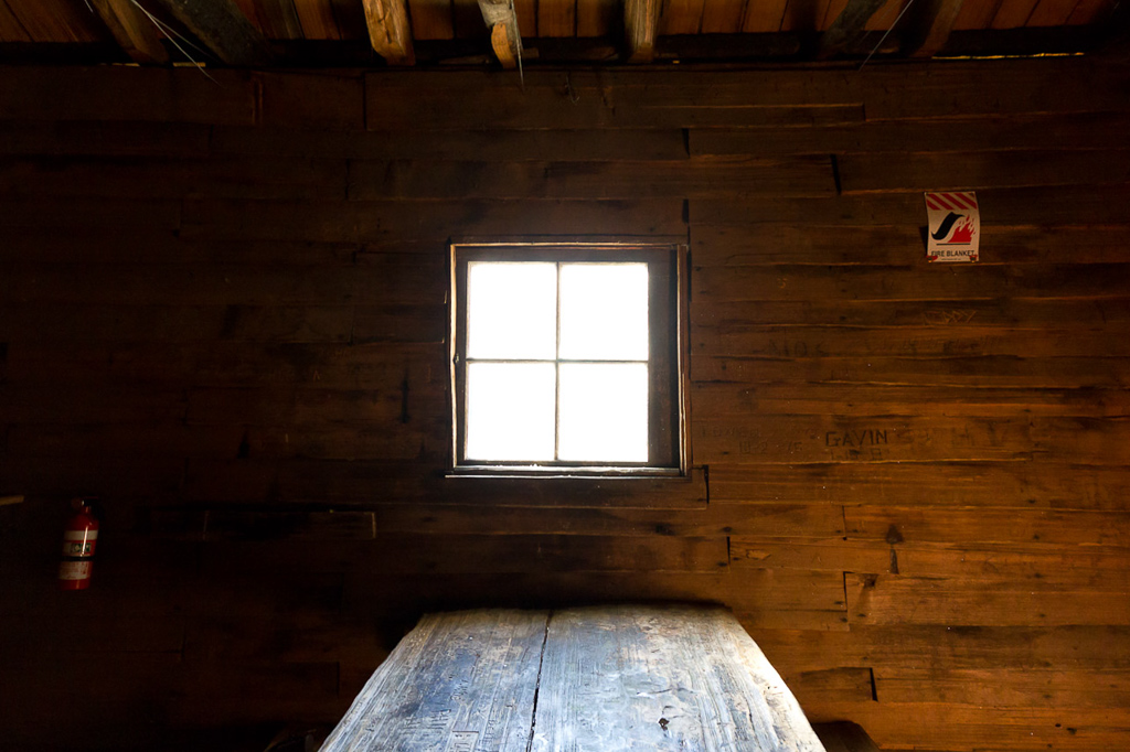
The Du Cane Hut interior doesn’t look so rustic with a fire blanket and extinguisher on the wall does it? In Lightroom, I just cloned some of the panelling around the items and voilà! Gone! If you didn’t know they were there you wouldn’t know any different.
Yes, the picture looks better, but it’s not really showing a moment in time is it? Do other people do this? I felt a little queasy about it, as it goes against my photography principles.
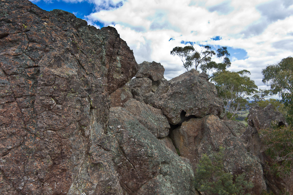
Not according to the photographer I mentioned earlier, who says editing like that is ‘normal’. Piece of rubbish on the ground in a landscape photo? Just clone it out. I could suggest to pick it up, but you know what I mean. This is how easy it is and I’ll show you. The photo below is at Hanging Rock.
[fusion_separator style_type=”none” top_margin=”4″ bottom_margin=”4″ sep_color=”” border_size=”” icon=”” icon_circle=”” icon_circle_color=”” width=”” alignment=”center” class=”” id=””/]

[fusion_separator style_type=”none” top_margin=”4″ bottom_margin=”4″ sep_color=”” border_size=”” icon=”” icon_circle=”” icon_circle_color=”” width=”” alignment=”center” class=”” id=””/]
Well, it’s okay, other than the person in a pink top and blue jeans lying down in the middle of the photo! That’s kind of annoying, so guess what?
[fusion_separator style_type=”none” top_margin=”4″ bottom_margin=”4″ sep_color=”” border_size=”” icon=”” icon_circle=”” icon_circle_color=”” width=”” alignment=”center” class=”” id=””/]
[fusion_separator style_type=”none” top_margin=”4″ bottom_margin=”4″ sep_color=”” border_size=”” icon=”” icon_circle=”” icon_circle_color=”” width=”” alignment=”center” class=”” id=””/]
Yep, gone. It’s that easy. Yet I must be some sort of photo romantic, as it still doesn’t sit with me very well. Then again, in the history of photography this ‘removal’ of things has being going on for years.
There are a lot of cases, but one picture that comes to mind is the famous Kent State photo taken by John Filo. In that photo the fence post was airbrushed out in the early 1970’s and you can still see that photo around without it there.
Does the post ruin the shot? I wouldn’t have thought so, and I reckon I’d never noticed it until it was pointed out. Now I know it’s there, I see it all the time! People talk about digital image manipulation, which is not really correct when photographers have been doing the same thing with film for years. It’s just easier to do now, that’s all.
Oh yeah, manipulation can’t make a crap photo suddenly look like a world beater. It still comes down to the composition and lighting and all the post production stuff can only enhance a picture. Well, that’s what I reckon and I’m sticking to it.
My photographer colleague can be a bit of a ball breaker though and mentioned things I would never have thought of in a hundred years. In fact, it sort of puts me off photography a little when I hear this stuff. I showed her some photos and asked for an opinion. Firstly, here’s some rocks in the Ovens River near Harrietville which I quite like.
[fusion_separator style_type=”none” top_margin=”4″ bottom_margin=”4″ sep_color=”” border_size=”” icon=”” icon_circle=”” icon_circle_color=”” width=”” alignment=”center” class=”” id=””/]

[fusion_separator style_type=”none” top_margin=”4″ bottom_margin=”4″ sep_color=”” border_size=”” icon=”” icon_circle=”” icon_circle_color=”” width=”” alignment=”center” class=”” id=””/]
Photographers opinion? “No, the problem you have is the rocks aren’t wet”. Huh? Do you realise she carries a water bottle and squirt rocks to get a glistening sheen on them or in this case, have thrown water from the river across them? What? Yep, apparently that’s what you do. The photo is crap unless your rocks are wet. By the way, it’s not her who made this up, but it’s what she was taught during her photography courses.
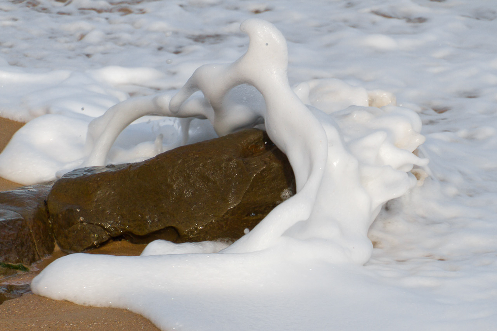
Okay, fail. So, I thought I’d show her another rock and this time I knew it was wet. It was during a stroll on the George Bass Coastal Walk and I liked the soufflé look of the foamy water.
[fusion_separator style_type=”none” top_margin=”4″ bottom_margin=”4″ sep_color=”” border_size=”” icon=”” icon_circle=”” icon_circle_color=”” width=”” alignment=”center” class=”” id=””/]
[fusion_separator style_type=”none” top_margin=”4″ bottom_margin=”4″ sep_color=”” border_size=”” icon=”” icon_circle=”” icon_circle_color=”” width=”” alignment=”center” class=”” id=””/]
Photographers opinion? “You took that in the middle of the day didn’t you? The light is wrong. It should be at either dusk or sunrise for the best light”. What? I replied I was on a walk and it’s a bit hard to get the photo at the ideal time, whilst needing to cover a number of kilometres in a day. Answer? “Well, if you don’t do it properly, you shouldn’t do it at all”. Grrr…
Okay, time for something different. How about a feather shot? Surely I can’t go wrong here?
[fusion_separator style_type=”none” top_margin=”4″ bottom_margin=”4″ sep_color=”” border_size=”” icon=”” icon_circle=”” icon_circle_color=”” width=”” alignment=”center” class=”” id=””/]
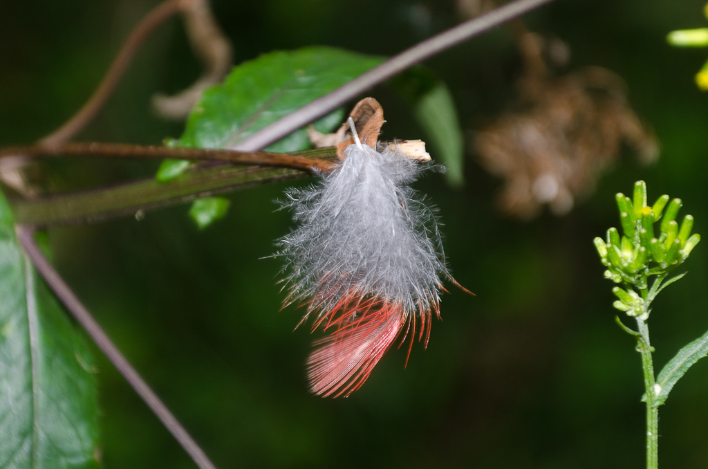
[fusion_separator style_type=”none” top_margin=”4″ bottom_margin=”4″ sep_color=”” border_size=”” icon=”” icon_circle=”” icon_circle_color=”” width=”” alignment=”center” class=”” id=””/]
Photographers opinion? “Yeah, it’s too green. We don’t do green. It doesn’t photograph well. If you wanted to do it properly you should have put a black piece of felt behind it”. Huh? It’s tough work impressing these photography people.
You know what else? She carries a pair of secateurs everywhere and if a small branch is in the way she’ll just snip it off. In fact all of the photographers she knows do the same thing. What? I tend to push a small branch out of the way, not snip the bloody thing. Maybe I’m not cut out to do photography for a living!
So, there you go. A shorter post for a change (whew). I can’t say I’ve altered many photos over the years, but apparently it’s okay if I do. Oh yeah, next time you’re out hiking, don’t forget to get your secateurs out, wet your rocks, carry your black felt blanket and only take beach photos at sunrise or sunset.

The pros are definitely a different breed. When I have seen them working they often take hours for a single shot taking hundreds of variations.
Hi! I've been reading your blog for about a year, but never commented 🙂 I just have to say that I disagree with your pro friend. I think that the rocks look fantastic dry. I always view it as "I'm not taking the photos for photographies sake, I'm taking them to capture the time and place, where I was present for a moment of my life." If they happen to be award winning photos, then all the better :). Anyway, just my 2 cents worth.
My plane was shot down in this post! Great reading again by the way. I take so many photo's that I cringe thinking about from a photographers point of view. I break all the rules, and never having done a photography course I wouldn't know half of them anyway!
I spent 10 years as a Graphic reproducer scanning endless photo's for all sorts of camera and photography magazines, retouching scans, changing colours, altering images in Photoshop day in day out.
I saw some amazing photo's but still find Joe Blogger with half the glass of a Pro, takes some very worthy shots.
Tips from the Pro's do help though. 🙂 …and thanks for sharing them.
Yes, you're right there! Dedication to the craft I guess and also knowing what they're looking for and doing! I'm a bit too hit and miss, but I think the aim is to have a short distance to walk and allow for more time to snap photos.
There's times I have a tripod with me, but I can't be bothered to set it up! A bit time consuming and I end up leaning the camera on a tree or something. No wonder I take a lot of crap pictures that are just slightly blurred! I should do a couple of short 'photography' only walks and see what happens. Might be a bit boring though? Prefer to walk further!
Hey Will. Thanks for the comment! Nice to see a long time reader pop up as it's much appreciated!
Yeah, I liked my dry rocks because of their colour, but the photographer was saying they'd look a lot better wet. I've no idea, but when I see rocks now I think about that business! I can't say I've gone out of my way to kick water everywhere just yet though.
I do like the photo as a moment in time, and if I manipulate it by removing things I feel a bit dissatisfied even though the result may look better. It's not really the same is it? My alterations in this post are minor, but I've seen photos where entire telephone poles and wires have been removed! That's a Photoshop thing, but I haven't gone to that extent to change a picture, so I can't say I've learned how to do that. I was bothered just by removing a fire blanket!
Thanks for your two cents worth!
Hey Darren. Thanks for dropping by. You're not alone about taking lots of photos. I've had day walks where I've taken 300 plus. Completely out of control and all the quantity does is make it harder to sort them out at the end of the day! I do try to get some composition happening instead of going nuts (I think).
Yeah, I break all the rules as well. I mean, I've always read that I should be bracketing photos, but I rarely bother. Imagine how many photos would be taken if you bracketed pictures all the time?! I stick to my hit and miss method, but I should really do some sort of course to get a different mindset I suppose. Get some new ideas about taking photos. Maybe one day!
You must be pretty handy on Photoshop then if you did that sort of job for ten years?! I've been told to advance to Photoshop, but everything starts adding up doesn't it? Time being available is the main thing!
Yes, I guess all the photo gear in the world means nothing if you can't compose a picture! The trouble with photography is the more I learn, the more I can see flaws in pictures. It leaves one never quite satisfied and I keep thinking of stuff like, "If only I took the photo two more feet to the side" or "I should have got lower to the ground to change the angle". That's the sort of crap I think about later! My photos from a year ago are better now though, so I guess it's all trial and error.
Hi Greg – I heard a talk by a landscape photographer of some renown. He was asked if digital and all the editing tools available now (Lightroom, Photoshop etc etc) made it easier to get "the shot". His advice? Take a better picture. It's still all about set up and lighting and composition… That said, there's a time to hike and enjoy it, and a time to go out and try to get the perfect photo. They are rarely on the same trip!
I agree with Jim's "Take a better shot" comment, and you're right about looking into a course. I probably should head down that road too, at least for the sake of doing the job right. After time spent in the trade, for some reason I never post edit any of my shots on the blog.
I think I may have a couple that I did some dodgy tilt shift work in the Photobucket slideshow, but other than that every photo in the trip reports are as they were taken. Probably shows too, but for me it's about the adventure anyway and the photos come second.
Plenty of time and opportunity to work on them though 🙂
Hi Jim. That's very sensible advice. There's a bloke at work who was banging on about digital photos as, "You never know what you're looking at. They can be altered so much". He wouldn't be convinced by the talk that a crap photo can't be manipulated into a good one! Oh yeah, manipulation has been going on for years. Some of the better ones I've seen are of Stalin photos and blokes around him disappearing from pictures as the years go by!
'Take a better picture' is so simple, but so difficult isn't it?! Every time I take a photo I'm trying to take a better one, but it doesn't always work out that way. You're right, I should just have a dedicated photo trip of a short walk and take my stuff such as a tripod and not have to worry about keeping moving all of the time 🙂
Yes, I think a course would be handy just to hear a different perspective about pictures. The person at work I mentioned in this post did a course over a number of years. I'm not sure if I have the mojo to do that for the long haul!
Yeah, it's a good attitude to put the experience first and the photos second. I started out like that and I remember hikes less than five years ago where I didn't even take a camera! I used to think, "What's the point?" Wow, times have changed now! Always finding something different to incorporate. I liked your last post which had those low down shots. I neglect that and I should give it a go. I keep thinking, "Gee, I don't want to bend over that much!" I should just lie on the ground and get dirty for a change 🙂
Hi Greg, an interesting insight into the world of a photographer.
Having seen the efforts that some blogger’s (including yourself) go to with your photos it has certainly made me more conscious of the quality of photo I post.
Interesting comments regarding the time spent walking v’s the time spent taking photos this also raises the question of high quality bulky camera v’s compact camera and the compromises that entails.
Maybe time for me to head off to school to learn some of the basic too.
Hi Wazza. Thanks for the kind words about the photos! I still don't what I'm actually doing with my photos. I never print any, I don't try and flog them off to anyone, so they just sit on hard drives. I've thought of printing some now and again, but I never seem to do it 🙂
Yes, I still feel a bit 'old school' by carrying a DSLR around on my walks which I freely admit is a complete pain. Heavy and awkward, but the biggest thing I like about them is a viewfinder! I know there's plenty of compact and 4/3 cameras, but there's that screen to try and compose a shot on and I just can't get into it.
That's the thing though, it all depends on the compromise. I've thought of the Sony NEX-5N which Hendrik Morkel and the Goat rave about and it looks like a great camera, but should I spend more money? Not right now and really I should just be happy with what I've got 🙂 Cameras are an endless pit of money these days! I remember buying a Nikon 35mm years ago and that was it. There was no need to update, but it's a different world with digital! It doesn't help things when I look at the upcoming Nikon D800. 36 mp? Insane and I'd love to have one!
Heh, thanks for that. You're reminding me about the couple of times I tried to enter photo competitions (in our local club), although they were judged by a professional outdoor photographer with many calenders to his name.
I do tend to be the sort of person who goes for rapidly-shot quantity with my hand-held camera (although one I selected for its nice photo-taking qualities) rather than quality and then weed out the excess afterwards. I make an effort to make my photos look reasonably nice and be framed well, but I don't think I'd ever take that judge's advice and carry around fluorescent coats to hand to people any time I wanted them to be in a frame… because apparently people are only worth having in a shot if they're wearing something that makes them clearly stand out. Apparently this photo was framed really well, but the chick has a billy hook stuck up her nose. (Fair enough.) This one was also (apparently) alright, but when someone's drinking out of a mountain tarn they're meant to have a mug instead of a tacky looking water bottle. 🙂 He was at least doing his best to distinguish objectively—everyone who didn't win anything was given justifications about how to improve their photo.
I think what I've since realised is that I just don't care about the professional brand of outdoor photos too much. Having a technically brilliant calendar-worthy photo doesn't mean much to me if there's not a story behind it that I can somehow relate to. I take photos to remember where I've been and what I've seen, and the things I like about getting outdoors. I also figured out that I prefer photos that have people, or signs of people (like campfires or tents or whatever), because it reminds me that it's not just the environment, but getting through it. Anyway, I'll keep taking the photos I enjoy, I guess, and leave the rest to the professionals.
Interesting and timely post here, Greg. I think, as walkers, our attitudes to pictures often evolve. At first we just want "a record". Over time we get a better camera and with some experience, and being exposed to great outdoor photos all the time in our reading, we pick up a few tips and try to linger that few seconds longer to compose etc. We gradually move to less "automatic" modes on our cameras. And for many of us, that's as far as it goes.
But some of us, and I think you and I fit in here, grow to really love the process of taking pictures, and come to see the photography as an integral part of the walk. They complement the outside action and give us something absorbing to do when we're not out walking. And then, if you or your readers are like me, you progress to the ultimate photo tragic's level of actually planning a walk with the PURPOSE of taking pictures. I've even had walks lately where I spend more time bent over my viewfinder than actually walking!
Not long ago I pledged I wasn't going to censor myself here in Korea when I take pictures – framing them as I did in Japan to hide the ugliness nearby or in the background etc. But now I can't help it: my pictures are often an idealisation of what I WANT Korea to look like! I still photograph rubbish and ugliness, but as an end in itself, in its own picture, and in that case I go WILD and actually try to EMPHASISE THE UGLY – as creatively as I can! Most of my "manipulation" thus occurs in the framing and composition, what I try to blur out or leave in etc, as I have never used post-production software more elaborate than iPhoto. I still think a lot of Photoshopped outdoor pictures look HYPERUNREAL – but I now see no problem with working on contrast, sharpening etc – and even hiding little unpleasant details like your hut picture.
I say your post was timely as I feel ready to make the leap to Lightroom – forum posters who use my camera tend to rave about it rather than the others. And if it's as easy to use as you say, I will be less apprehensive about making the leap very soon. I want my pictures to look like what I saw in my head when I pressed the shutter – though the bloke who made that comment about getting your shot right as you take it was spot on!
Sorry this was so long – I think about this topic a lot these days…
Bugger the informed photography colleague Greg – I LOVE your rock photos – both dry and foamy! They're brilliant shots
Hi Mike. Thanks for the comment. You see what I mean about photography gurus?! If someone was drinking out of a tarn with a bottle, well, that's what was happening! If you ask them to put the bottle away to get a mug out which will look 'better', well, the photo has been manipulated, surely? I just don't get that stuff which means I'll be a crap photography student and will never win a photo competition 🙂 I mean, if you have to start looking for people in fluro tops then I'll give taking photos away as I find that crap to be quite tedious.
Yes, photos have to be what you want to look at later on and I think I do that most of the time these days. I abuse the polarizer, but the reason I do is because I like that look of an outdoor photo. If I was fair dinkum about photography, I'd mix it up a little. It's good you take photos that include people in your outdoor shots. I don't at all! I really avoid everyone photographic wise on walks. I've been on walks with people and they have sometimes said, "Hey, take a photo of me?" I end up saying, "Yeah, okay, but do I have to?!" I see so many people day to day that I don't need them in my outdoor shots as well 🙂
Hey Goat. You've really cranked up your photo quality! You've got some great pictures on your blog. I tend to only use fully automatic settings if I'm knackered and couldn't be bothered or the light is really weird! I try and stick to Aperture setting most times and switch to shutter priority for animals or a plane going overhead!
Yes, I know what you mean about taking photos as a reason to go walking! I picked my Bells Beach walk solely by the weather forecast as I wanted blue skies for the polarizer! I wish I used one on the Great Ocean Walk which means I'll probably do it again just to get polarized photos! You know what? It can be obsessive! I always wonder what the point of trying to perfect a photo is. I mean, I don't print them, don't sell them and I just tend to peruse them on the computer for a few days and then go out and take another hundred. If I don't have a camera whilst walking I'll feel like I haven't done the walk as it's undocumented! Pretty sure it's the first sign of mental illness!
My photos are better now than a year ago, which I'm sure is just because I'm taking so many in different types of light. The joy of digital in which you're able to take hundreds of pictures just to practice different things! I've got dozens of photos of my lounge room just from playing with different settings! I remember the old days with my 35mm camera having a pencil and note pad to write down the settings of each photo for reference later. That was time consuming, plus expensive getting film developed.
Yes, heavily Photoshopped pictures do look unreal. I do like to keep the finished photo pretty similar as it looked in real life. I mean, I've never remotely got into HDR photos with the insane skies which look so fake. I hate it when I see a HDR photo win something in a photo competition as I reckon they're just bullshit! In your case, if the ugly is all around you in Korea regarding rubbish and crap like that, then I reckon I'd start including it as well. You're right in that ugly stuff can look fine if the photo is composed well. You'll never spend your time editing out rubbish in some of your Korean photos as it would take you all day!
Lightroom is good and like all these things has a bit of a learning curve, but just playing with it for a day or so and you'll pick it up fine. There's some good Adobe videos around that are handy for tuition as well. If you shoot RAW you'll see how easy it is to radically change a photo! Best of all, if you stuff something up you can just press reset and you're back to the start with no loss of data unlike a JPEG. I saw it priced the other day for US$149 which seems pretty reasonable as a few years back it was over $300. I'll update mine to Lightroom 4 in the next week or so myself as there's a new features that I think I'll like to play around with!
'Getting the shot right' is a good idea. I think I do that with all my photos, but upon developing that's not the case at all!
Hi Judy. Thanks for the comment and nice words about the pictures! Yes, I liked those photos as well, but they're never going to win an award. They're not at the sufficient standard for such a thing! My aim is get a picture published one day on the Bureau of Meteorology weather calendar, but that's pretty tough! I don't think they have to be as technically perfect as most competitions though. I just need to capture some unusual weather. I might have to move to Darwin!
I've been on walks with people and they have sometimes said, "Hey, take a photo of me?" I end up saying, "Yeah, okay, but do I have to?!"
Hah. 🙂 I tend to be by far the most prolific photographer on most trips I go out on with other people, even though it's mostly waving camera pointing and shooting, and I do my best to make my photos look good and have worked out a variety of shortcuts to make the camera do what I want, but I won't sacrifice much enjoyment to take a technically perfect photograph. If it affects people at all I think it tends to be more annoying as when people are involved I prefer getting candid photos because that's all about what I remember. Sometimes people ask me if I want a photo with me in it, which just seems weird because it never really occurs to me. (I never see myself in places I visit, after all.)
Something else I enjoy is repeatedly pulling my camera out and taking photos in what many people would consider "bad" weather (got it a lot in New Zealand for some reason), because amazingly enough very few people do, and I think there are missing records of some of the most awesome sides of the environment. (This one wasn't acceptable because my speedy pull out and snap didn't focus on the subject properly.) I tried entering a couple of them in a competition once and was knocked down because of the water on the lens, which for me just added to part of the story.
Each to their own… I like photos to relate to interesting stories, but that's tough to justify with an objective comparison of photographs as is necessary in most competitions. 🙂
Yes, I know what you mean about being prolific. I easily take a million shots more than anyone else I get to walk with! I'm also the same about myself in hiking photos. I just don't do it and I've got entire trips where there's no photos of me at all. I should change that as I need to record myself over the years I guess 🙂 Candid is good if you can pull it off! That easily is the biggest problem with a whopping big DSLR. Such an invasive beast of a thing! Point it at people and candid goes out the window. I need something more discreet I think. My son Ben takes lots of shots of people, but he uses a Panasonic GF1 which is ideal for that sort of stuff.
At last a crap weather photographer! I like wet photos as well and my Mt Bogong trip was full of them, complete with water on the lens. I didn't even bother trying to keep the lens dry on that walk, as the rain was torrential at times, but you're right. The wet lens reminds me a year later how much rain we were walking in! Knowing the technical requirements of a photo competition, I wouldn't even bother putting my wet photos up for examination! This is what annoys me at times about this photographer business. It comes across as terribly elitist at times about what standards should be. It really takes the fun out of it!
What I've mentioned in this post about wetting the rocks etc popped up again by accident when I picked up an old edition of 'Wild' magazine (125) last night. There's a blurb about photography and here's a quote from the article, "…Before making your exposure, have a look around the frame for any stray leaves and branches that will detract from the final image. While I do not condone damaging any flora to create a more pleasing image, moving a few items, wetting dry rocks in the foreground and generally cleaning up the area can make the resulting images more pleasing to the eye…"
Wetting the rocks again! Oh yeah, there's a lot of branch snipping going on as well 🙂
First and foremost, photos in the end are meant to please the person taking them I would have thought. I stick to stuff I like to look at later without getting too caught up in it. There's a bit of a buzz though when they get uploaded onto the computer and one particular photo really stands out. That's when I think, "I should do something with this picture. Competition? Anything like that?" Then I forget about it and the next walk happens and I take another hundred photos and the whole process begins again 🙂
I definitely enjoy rain. People sometimes don't venture out in it at all, but I think it's often worth it just for a different perspective on what things can be like.
I've never tried a DSLR, but before I started bringing a hand-held camera I didn't really take any photos. I kind-of got my camera to take photos with, so didn't want to risk getting something that I'd barely ever pull out except when I had several minutes. It turned out that a Canon Powershot A710 was great for me (takes awesome photos with various automatic modes, imho), and when that finally drowned after 18 months from all the dodgy weather things, I replaced it with an A720 which is almost identical. I don't know what I'm going to do next, because they're completely doing away with optical viewfinders and AA batteries on small handheld cameras! Maybe I can find a second hand A720 out there that hasn't been beaten up nearly so much.
I can't say I've ever made much effort to tune the scene for a good photograph, but two things I never bother with photographing (because they look so dull) are people's plastic bags lying all over the place, and just after the beginning of a lunch stop when others have put down and started to open packs. The latter one especially seems to be a common photo theme and I think it's because people often pull cameras out and take photos when they stop… which is about the time everyone else starts looking very messy because they're in the middle of doing the same thing. 🙂
Until now I'd never heard of the rock-wetting thing. I wonder if that can be done in post-processing.
I remembered the other reason I enjoy putting evidence of people in the photos I take, which is that it reminds me that I've actually been somewhere. I don't wish to discredit good technical photographers at all, but many of the competition-winning photos I've seen can be technically brilliant, yet show nothing to indicate they have anything to do with hiking or getting outdoors whatsoever. If you have a beautiful landscape photo, what's in the photo to prove that you're not just standing on the side of a road somewhere? A couple of years back, I'm positive that one of flora & fauna winners for the competition in our local club was taken in the city's botanic gardens! But from the evidence in the photo it can't be proved or disproved one way or another. Can't beat that, I guess. 🙂
Yeah, not many cameras have AA batteries any more. With the smaller size camera I guess the lithium style ones built for the camera make sense. A bit of a bummer as you could always get AA batteries somewhere. I reckon if you're going to look for a camera like that then eBay would be the go. Then again, I did bid recently for a digital camera that was about four years old and the price it went for was absolutely crap! Insanely overpriced for what it was, so I lost interest in eBay 🙂
Yes, I know what you mean about a photo could be anywhere. There's no way of knowing is there? I've entered a koala shot in a couple of competitions and it's never been short-listed even though crap koala shots do! I reckon because it's close-up people think it's been taken at a zoo! Who knows, but that's one reason I don't enter competitions. The end result leaves you feeling as if your photos are rubbish 🙂
I've never thought about the pack open photo. Now you've mentioned it I guess it is quite common. I should take more people photos I guess. I'll do it one day, but I don't want to rush these things 🙂
Wet rocks? No, I reckon you couldn't replicate it. You've got get in the river and throw some water around!
Greg a very interesting, report, as for green take a look at http://robinwong.blogspot.com/2011/12/olympus-mzuiko-12-50mm-f35-63-review.html there is some nice green there. I moved to an EP 2 and which has improved the quality of photos of my blog and I have recognised that the lens, location and time of day all make for the ideal picture.
Thanks for posting and I look forward to your continued journey down the photographic trail.
Wow, that link you included has some fantastic shots in it. I'm very envious, but where's the black felt blanket?!
Yes, I've checked your blog and the EP-2 certainly produces some lovely photos. Yeah, timing of the day makes a big difference. I was even told that landscape photos not taken at either dawn or sunset are not worth it! Tough world these photographers live in 🙂
I've actually got to get some more bokeh happening I think. The Goat is driving me a little crazy with his bokeh, so I better get walking on the weekend to practice my depth of field tricks!
Thanks for the comment. It's much appreciated.